Client: Concept mobile app project for Antix Nightclub
Role: UX/UI Designer and Marketing Manager
Tools: Pen & paper, Figma, Canvas.
Timeline: 3 Months
Platform: iOS / Android
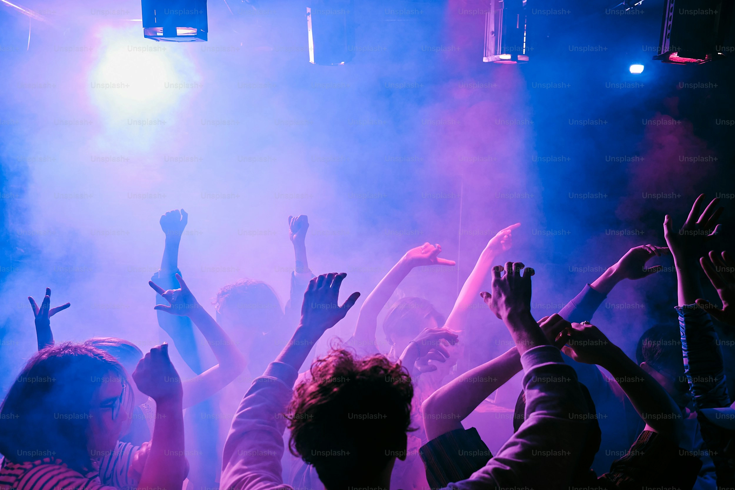
Antix is a late night club that's been a city staple since 2005. To keep
its vibrant community engaged, the goal was to design an app that gives
club goers direct access to events, rewards, and exclusive perks and
helps the club push updates and promotions efficiently.
Problem Statement:
While Antix has a strong local following, it lacks a digital platform to:
- Communicate upcoming events and offers directly to guests
- Build a loyalty system to reward frequent visitors
-
Provide a digital-first experience that reflects its real-world energy
Goals:
For Customers:
- Discover upcoming events easily
- Get loyalty rewards and VIP perks
- Stay updated via push notifications
For The Business:
- Increase customer retention
- Promote nights/events and drive bookings
- Collect insights on customer behavior
User Research:
To better understand the needs and behaviours of Antix's potential app
users, I focused on qualitative research through:
- Informal interviews with club goers aged 20–35
-
Observations of nightlife habits (preference for Instagram updates,
VIP culture, guest lists)
- Online reviews of Antix and competing clubs
- Competitive research from other night clubs apps in the area.
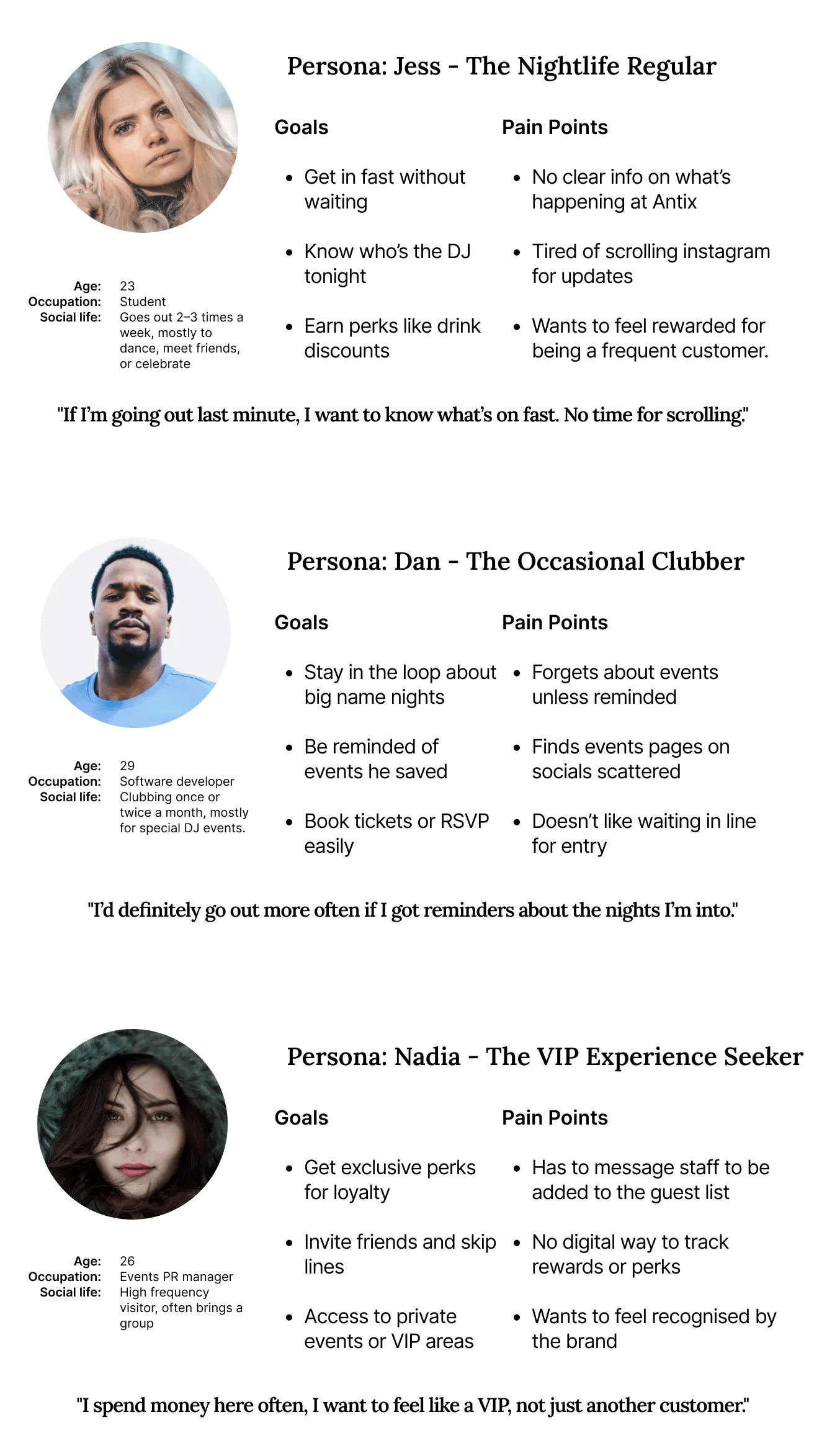
Creating Personas
Common Pain Points
-
Scattered or delayed communication about events (mostly via social
media)
- No way to track loyalty or access special treatment digitally
- Manual, outdated guestlist and entry system
- Lack of personalized offers or rewards
Key Takeaways
- Speed & Clarity: Users want instant
access to event details, DJ lineups, and offers especially close to
nightlife hours.
- Loyalty Matters : Regulars want
recognition and perks for their loyalty, not just a generic entry
experience.
- Notifications = Retention: Casual
visitors benefit from timely reminders about events they might like.
- Exclusivity = Value VIP style features
(skip the line, early access, private invites) build strong brand loyalty.
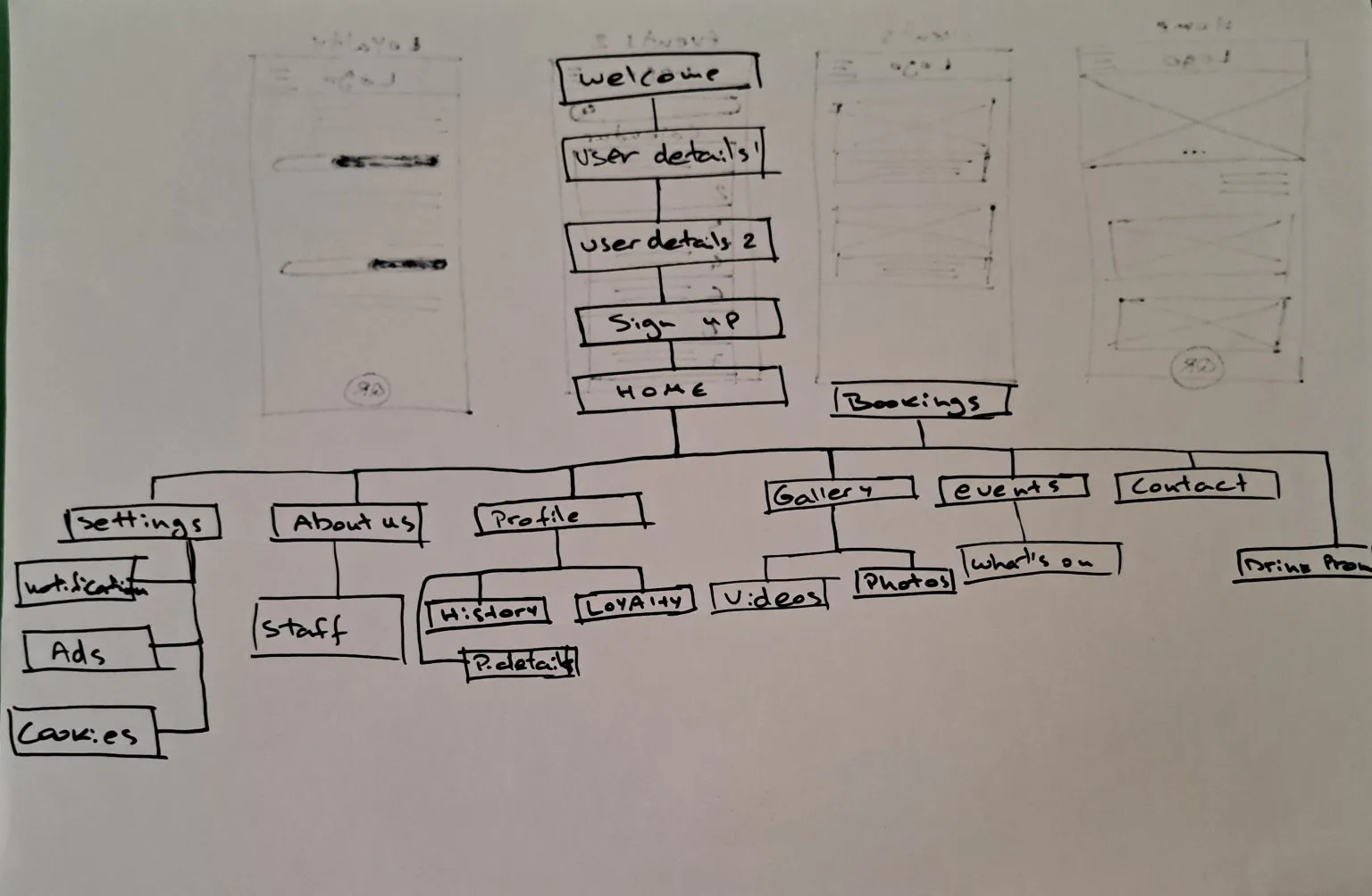
Information Architecture
I defined the key journies the users will take based on my personas goals
A. Jess (Nightlife Regular): Quick Event Check + QR Access
- Open app
- Land on home screen
- Tap tonight's event / DJ
- Check event details
- Tap QR button at door for entry
B. Dan (Occasional Clubber): RSVP for Upcoming DJ
- Open app
- Navigate to Events
- Switch to Calendar view
- Select specific date
- RSVP or Save event
- Get reminder notificaion
Nadia (VIP Seeker): Redeem Loyalty Perk
- Open app
- Go to Loyalty tab
- View points & rewards
- Tap to redeem "Skip the Line"
- Show QR at door
To ensure users can navigate the Antix app with ease, I created a clear
and intuitive IA map. It balances the needs of both regular club-goers and
first-time users, organizing content in a way that reduces friction and
aligns with user expectations.
Key design decisions
- Grouped related content (e.g., media under Gallery)
-
Prioritised features based on user needs (e.g., QR access, loyalty
progress)
- Designed a scalable structure for potential content growth
Sketching and Wireframing
To translate research insights into tangible ideas, I began the design
process with low fidelity sketches followed by digital wireframes. This
step helped define layout, hierarchy, and user flow without being
distracted by visuals too early.
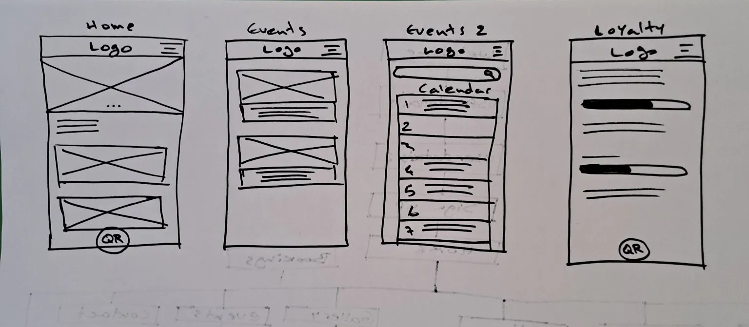
📝 Low-Fidelity Sketches
I sketched multiple core screens to quickly explore structure and
interactions. These included:
- Home:
Featured promotions, quick access to event highlights, and a floating QR
button.
- Events:
Scrollable list of upcoming nights and DJs.
- Events (Calendar View):
Date based Browse for planning ahead.
- Loyalty:
Progress bars for tracking rewards, offers, and special access.
These sketches allowed quick iteration and helped me think about the app
holistically from a user's point of view.
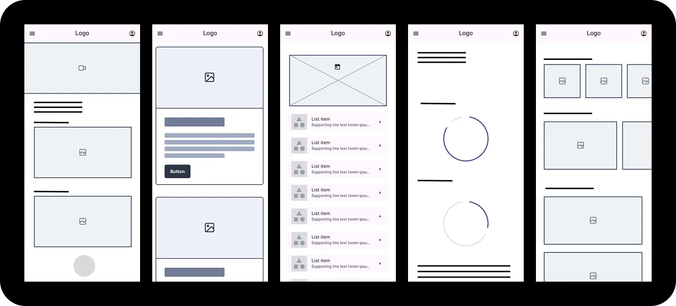
📱 Digital Wireframes
Based on the sketches, I created digital wireframes in Figma to define
screen layout and information hierarchy more clearly.
Screens wireframed:
- Home Screen
- Events Screen
- Events Calendar View
- Loyalty Screen
- Gallery View
These wireframes served as the foundation for user testing and early
feedback before moving to visual design.
Low Fidelity Wireframes
To begin translating insights from research into tangible design, I
created a set of low-fidelity wireframes to explore layout, hierarchy, and
core functionality. The goal was to rapidly iterate on structure before
moving into more refined visuals.
These wireframes helped:
- Define the essential content and flow of the experience.
- Test assumptions around navigation and event discovery.
-
Visualise key features like event access, loyalty tracking, and media
engagement.
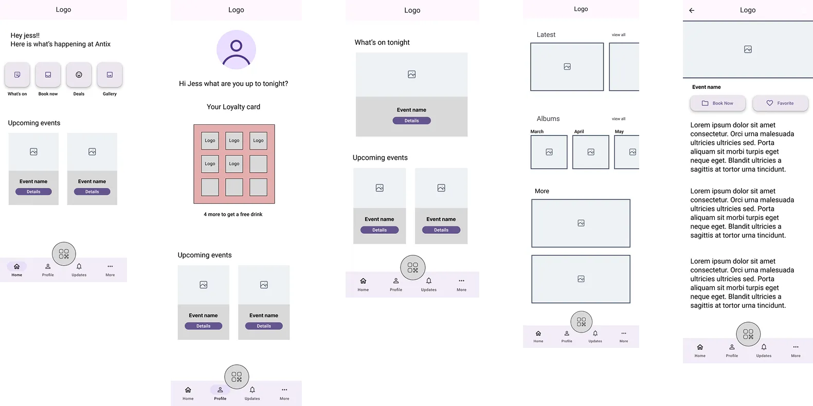
Screens Created:
- Onboarding Flow
– Welcomes users with a brief intro and streamlined sign-up (including social
login options).
- Home Screen
- Personalised greeting, quick filters, and highlight of upcoming events.
- Events Overview
– Displays all current and upcoming events with category Browse.
- Event Details Screen
– Dedicated space for event descriptions, lineups, and CTAs like "Book Now."
- Profile Page
– Showcases a user's loyalty card and upcoming plans.
- Gallery
– A media hub with latest photos, albums, and social features.
- QR Code Page
– A quick-access digital pass for event entry.
Each screen was designed with simplicity in mind and enough fidelity to
evaluate layout and logic, but flexible enough to allow changes based on
feedback.
🔄 Interactive Prototype
I built an interactive prototype using these wireframes to simulate the
core user flows. This allowed for early usability testing and helped
validate whether users could:
- Seamlessly browse and book events.
- Understand the loyalty system.
- Navigate back and forth between key pages intuitively.
🔍 Usability Testing (Low-Fidelity Prototype)
🎯 Objective
To evaluate the clarity and usability of the app's key user flows,
identify friction points, and validate early design assumptions before
progressing to high fidelity design.
👥 Participants
I conducted a moderated usability testing sessions with 6 participants (2
females, 2 males and 2 non binary) and created personas based on the
participants of the user research:
Jess – The Nightlife Regular (25, Social Media Savvy)
- Goal: Stays updated with club events and appearances.
- Tech comfort: High (daily Instagram TikTok use).
Dan – The Occasional Clubber (30, Busy Professional)
-
Goal: Finds events when free; wants a quick and smooth experience.
-
Tech comfort: Moderate (frequent app user, prefers simplicity).
Nadia – The VIP Seeker (28, Experience-Oriented)
-
Goal: Looks for perks and exclusive events, loyalty is a motivator.
- Tech comfort: High (comfortable exploring features).
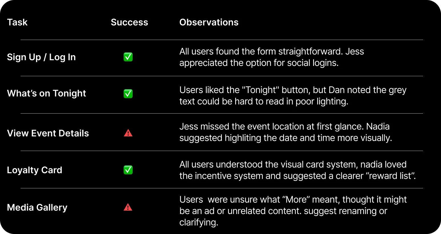
🧪 Tasks Tested
Participants were asked to complete five core tasks using the interactive
low-fidelity prototype:
- Sign up or log in to the app.
- View "What's on Tonight".
- Explore an event and find out when it starts.
- Navigate to the loyalty card and understand how it works.
- Browse the media gallery.
💡 Key Insights
-
Navigation was intuitive, with the bottom menu being easy to use and
understand.
-
Event cards need clearer visual hierarchy, especially
date/time/location.
-
Loyalty system was well received, but users want to see what the rewards
are for each stamp.
-
Terminology matters: Labels like "More" or "Explore" can be
ambiguous—clarity matters in nightlife contexts.
-
Profile personalisation (like "Hi Jess…") helped with user connection.
🔧 Improvements for Next Iteration
-
Highlight event timing/location
using icons or larger font.
-
Add a short description or visual cue under "More" in the gallery.
-
Include a visible reward tracker
under the loyalty card.
-
Ensure contrast and text legibilityis
strong for low-light/night use.
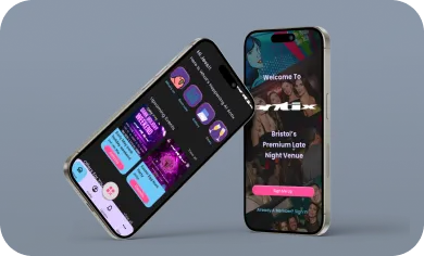
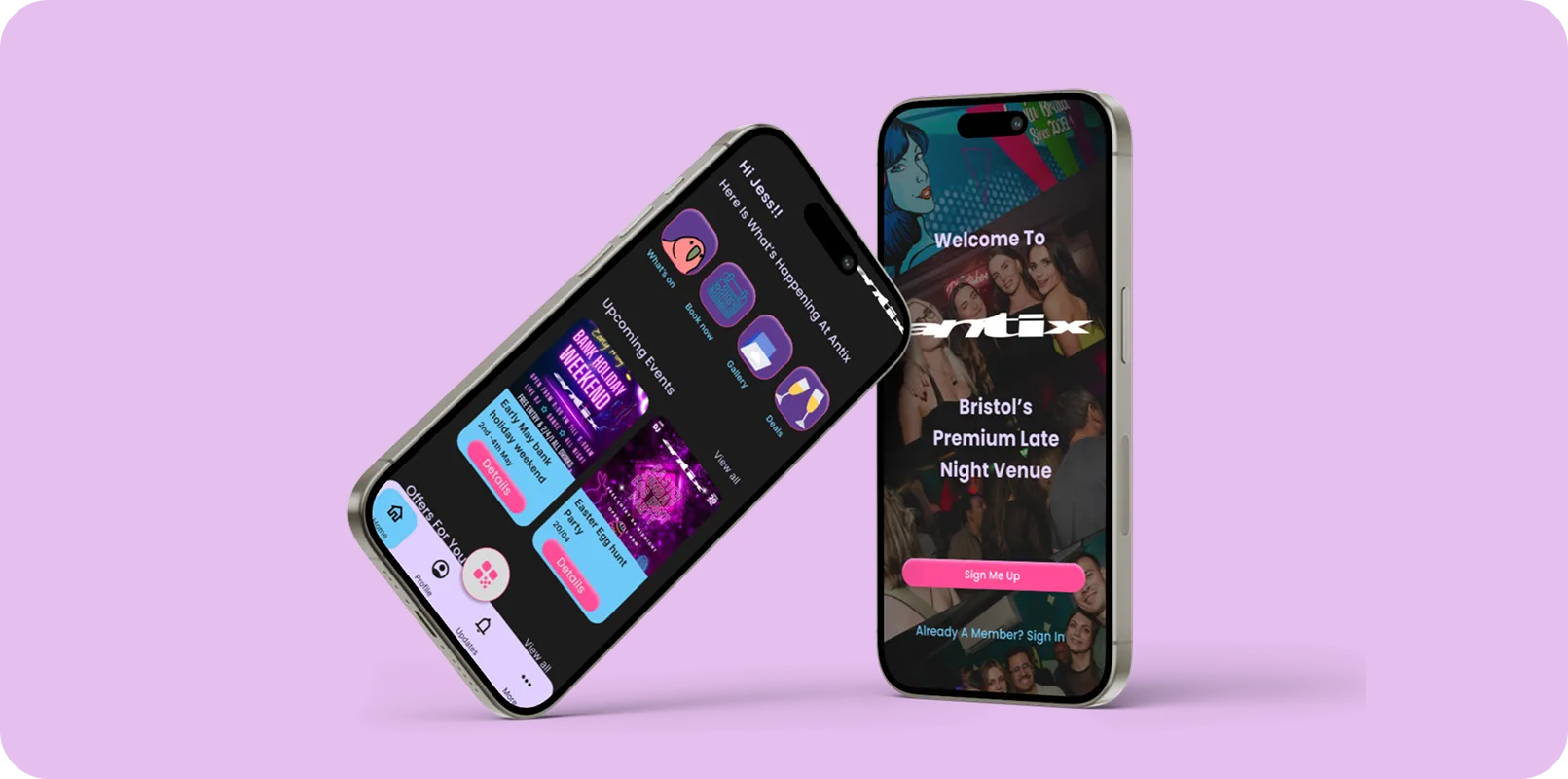
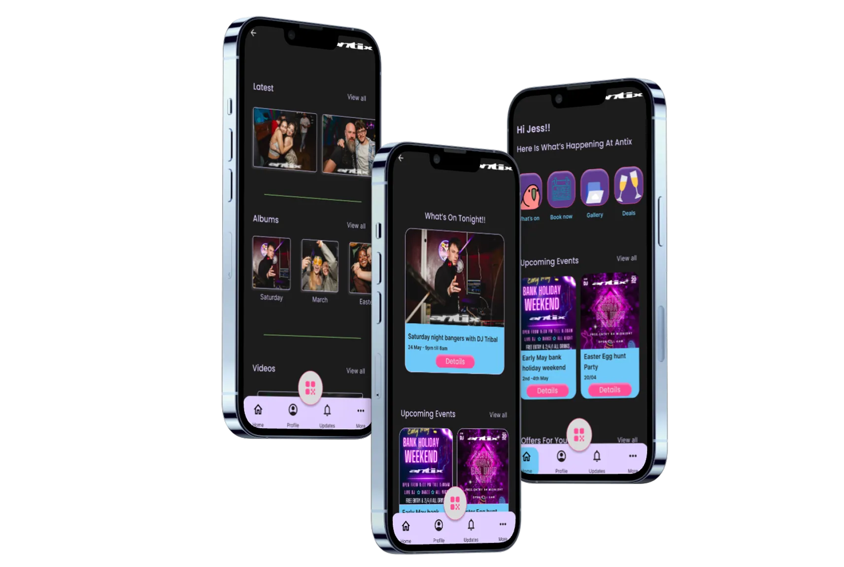
🔧 High-Fidelity Design
With feedback and insights from the low fidelity prototype testing phase,
I moved on to crafting the high fidelity user interface. The goal was to
bring the Antix experience to life visually vibrant, dynamic, and
intuitive while preserving a consistent and user centred flow.
Key Improvements from Lo-Fi:
- introduced a darker theme to align with nightlife aesthetics.
-
Added bright accent colors (pink and purple) for CTAs and highlights.
-
Used visual hierarchy with clear spacing, typography sizes, and color
contrasts.
-
Incorporated real images and event artwork to improve visual
storytelling.
Microinteractions:
- Animated button feedback for sign-up/login
- Swipeable gallery images
- Loyalty stamp animations upon QR scan
- Smooth page transitions
🎯 Usability Testing (Hi-Fi)
To simulate a real world testing environment, I conducted a round of high
fidelity usability testing using an interactive prototype with user
personas.
- Tool Used: Figma Interactive Prototype
- Participants: 3 personas (Jess, Dan, Nadia) from earlier
Tasks:
- Sign in and explore upcoming events.
- View event details and save one to favorites.
- Open loyalty card and scan QR code.
- Watch videos in the gallery.
- Locate the drinks menu.
✅ What Worked Well
⚠️ Areas for Improvement
Bright accents made CTAs easy to spot.
Gallery video player needs clearer play buttons.
Loyalty system felt intuitive and engaging.
"More" menu could be more descriptive ("Settings" confused some
users).
Smooth flow between sections via tab nav.
Users wanted filters for event types (e.g., genre, time).
Strong visual consistency built trust.
Some icons (e.g., QR code) needed text labels for clarity.
🚀 Next Steps
-
Incorporate feedback by adding filters and improving gallery
accessibility.
-
Consider accessibility testing (e.g. colour contrast for low light).
- Send it to the development team to start the development stage.
-
Develop a marketing strategy to onboard users with in app incentives.
✅ Reflection & Key Learnings
Designing the Antix Club app was an exciting opportunity to create a
digital experience tailored for nightlife enthusiasts. Throughout the
project, I deepened my understanding of user centered design, rapid
iteration, and the importance of aligning business goals with user needs.
One of the biggest challenges was balancing visual energy (to match the
club's brand) with usability, especially considering late night and low
light use cases. Creating clear navigation and ensuring accessible UI
components taught me how small details (like contrast, spacing, and micro
interactions) can drastically improve the experience. I also learned the
value of low fidelity prototyping and early testing. Getting quick
feedback from the personas, helped me iterate with purpose and prevent
design missteps later in the process.
♿ Accessibility Considerations
The nightlife audience often uses mobile apps in dark, crowded
environments, so accessibility was a key focus throughout the design
process. To improve usability and inclusivity, I considered:
-
High-contrast colour combinations for better visibility in low light
settings
-
Large, tappable buttons for ease of interaction during active or
impaired moments
- Legible typography with strong hierarchy to reduce cognitive load
- Clear icons and consistent labelling for faster recognition
🎯 Final Summary
The Antix Club app is a nightlife companion designed to help users
discover events, earn loyalty rewards, and connect with the vibrant club
culture in Bristol. The final product balances bold branding with smooth
usability, offering features like personalized event feeds, a QR based
rewards card, and an interactive photo gallery. From onboarding to loyalty
tracking, every interaction is designed to feel exciting, effortless, and
authentic to the Antix experience, ultimately driving user engagement and
venue loyalty.